Corporate Identity Design of Webwise Partnership, Edinburgh
< Back
 [/column]
[column width=”420px”]
[/column]
[column width=”420px”]
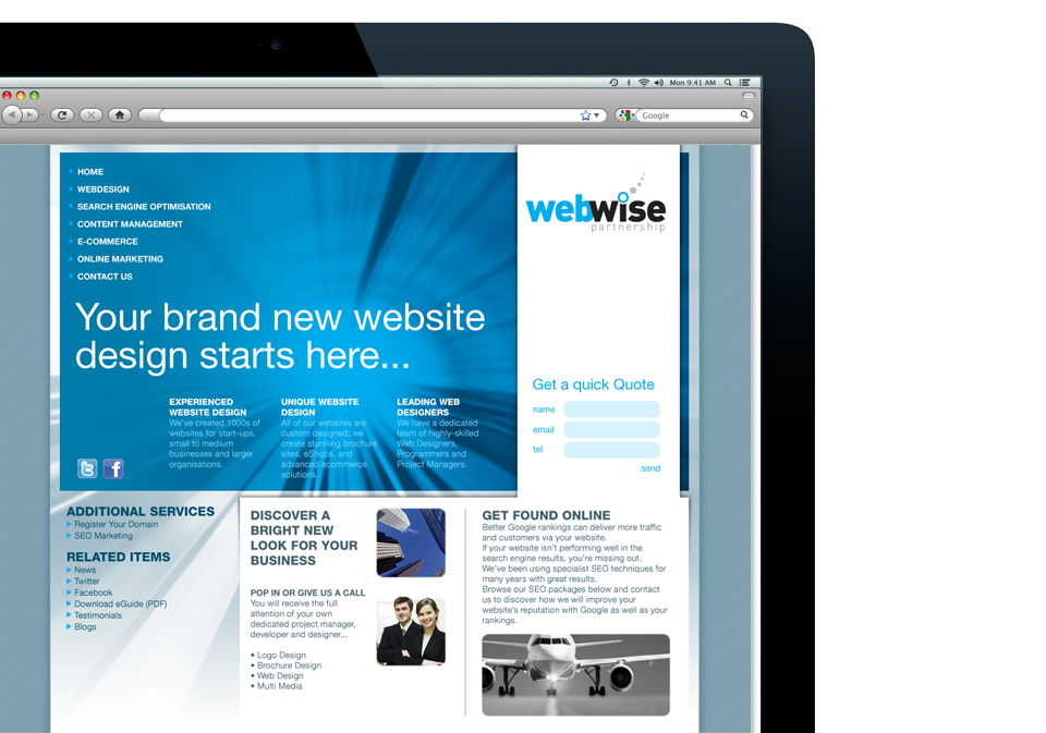
Webwise is a Digital Agency, based in Central Edinburgh who design and build bespoke visual themes for complex online stores, write content for social media and online marketing.
When Webwise was formed, it was immediately recognised that a well presented brand would distinguish them from the broad presentations of their competitors.
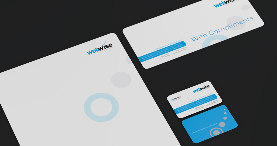
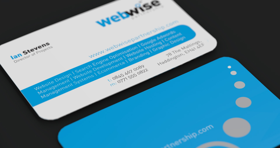
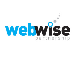
Their brand focuses on the simplicity and minimalism. A primarily typographic solution was developed, with the use of two strong colours, black and cyan. The communication and flow of information are key notions in what they do. The logo reflects on this with a symbolic antenna.
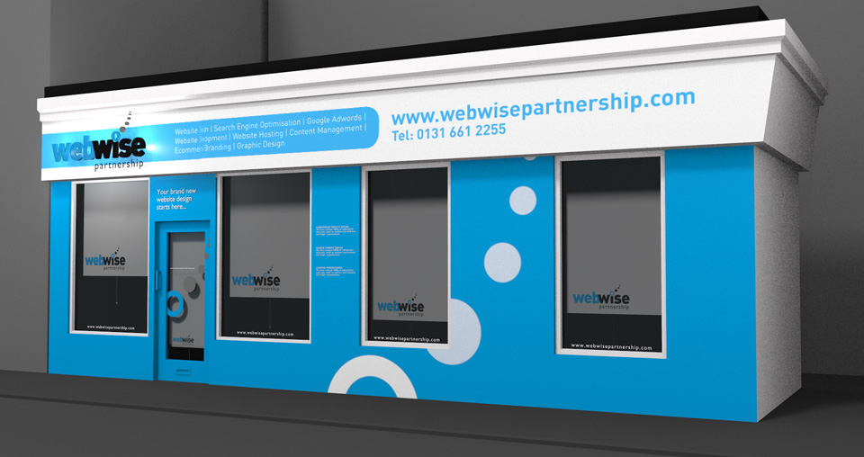
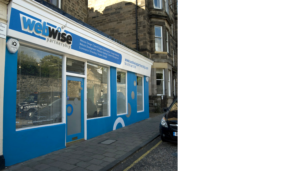
Keeping the geometric simplicity and using the strong contrast of the two colours, many accompanying marketing material was developed including their office front that jumps out from Edinburgh’s traditional sand-stone colour buildings. Their shop is an important point of sale. Many customers were driving by, noticed their studio and visited them to enquire about their services.
[/column] [end_columns]