Apro Development Corporate Identity
< Back [column width=”420px” padding=”50px”]
 [/column]
[column width=”420px”]
[/column]
[column width=”420px”]
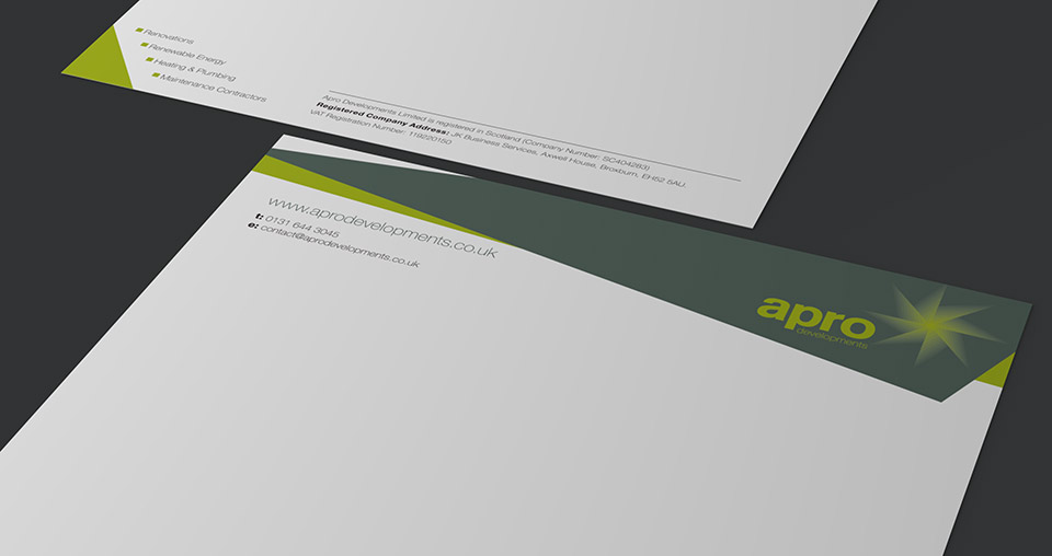
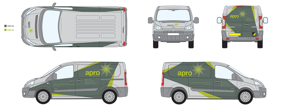
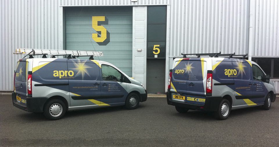
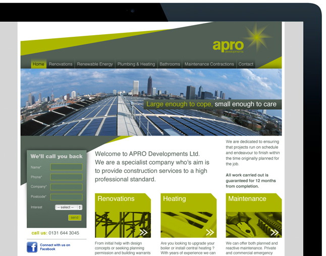
Apro development is a progressively growing company in renewable energy for domestic consumers. The design process began with analyzing competitors in the domestic energy sector to identify a positioning for the new brand. It was vital to communicate expertise and innovation. Together with developing visual devices a name “apro” emerged as a short, memorable name suggesting professionalism, progress and energy.
The brand elements were developed to convey apro’s different approach. The dynamic, sharp angles of the brand, the “flare” of the logo and the use of harmonic shades of green clearly communicates their mission, to be highly innovative and progressive within the rapidly growing green energy market.
[/column] [end_columns]