APME Logo and Typeface design
< Back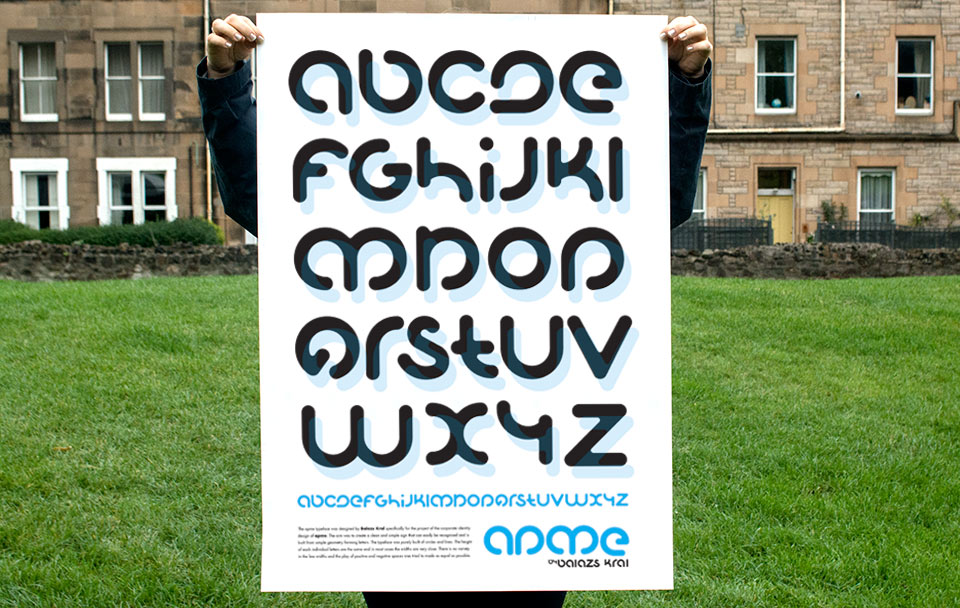 [column width=”420px” padding=”50px”]
![]() [/column]
[column width=”420px”]
[/column]
[column width=”420px”]
When re-formed, APME asked designers to come up with ideas for their new Brand Identity.
A clean, purely typographical but easily recognizable solution was thought of. The proposal was based on letters, derived from the same geometric shape, the circle. The line-width and the letter-height was kept consistent across the typeface.
The complete type-set was designed at a later stage with the view to be used on the various corporate documents and keep visual consistency between their publications. The width and height of the full-circle component was the core unit of the grid of their layouts.
[/column] [end_columns]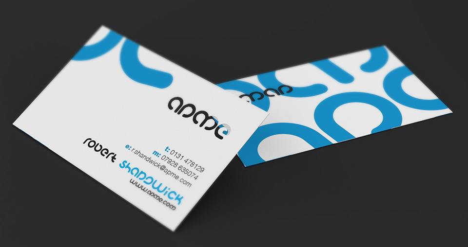
![]()